Overview
This guide demonstrates how to use the Bigdata Search Volume API endpoint (/v1/search/volume) to retrieve and visualize theme volume data over time. The script displays the evolution of documents, chunks, and sentiment for any given theme, helping you track narrative trends and coverage patterns.
GitHub Repository
Access the complete source code, requirements, and setup instructions.
Features
✅ Retrieves theme volume data from the Bigdata Search Volume API✅ Visualizes three key metrics: number of documents, number of chunks, and sentiment
✅ Displays daily values as bars (documents and chunks) or lines (sentiment)
✅ Overlays weekly average trends for better pattern recognition
✅ Generates high-resolution PNG charts with theme-specific filenames
✅ Supports custom date ranges and themes via command-line arguments
✅ Optional breakdown of the volume by source (
group_by) Use Cases
The Search Volume endpoint is valuable for several scenarios:- Evaluate Coverage: See how many unique documents Bigdata has available for your particular query
- Narrative/Thematic Screeners: Create a query and see how the defined narrative evolves over time
- Query Strategy: Check coverage and plan how to structure your queries accordingly
Group the volume by source
Add the optionalgroup_by parameter to see which sources contribute to the volume. Pass ["source"] to break down the results:
results.volume and results.total unchanged and adds results.groups.sources. Each row carries the source id, the number of distinct documents and the number of chunks, sorted by chunks:
id matches the source filter, so a row can be turned straight into a follow-up query restricted to that source. The list holds at most 1,000 sources; broad queries over long windows can hit that cap, so narrow the query or the time range when you need every source.
Group by content tier
Pass["tier"] to see how the volume breaks down by content tier:
premium-news, corporate-communications, expert-interviews, earnings-transcripts, regulatory-filings, podcasts, web, and private-data. A document belongs to exactly one tier, so tier counts add up to the totals.
Group by package
Enterprise users on the unit-based consumption model can group bypackage to see which data packages contribute to the volume:
id matches the ids shown in the Bigdata Store. A document can belong to several packages, so package counts may overlap and do not add up to the totals.
Prerequisites
- Python 3.9 or higher
- A Bigdata.com API key
System Dependencies
Matplotlib requires some system libraries for chart generation.- Ubuntu/Debian
- macOS
- Windows
Setup
1
Clone the repository
2
Create a virtual environment (recommended)
- Linux/macOS
- Windows
3
Install Python dependencies
4
Configure API Key
Copy the Open the You can obtain your API key from the Bigdata Platform.
.env_template file to .env:.env file and replace the placeholder value with your actual API key:Usage
Run the script
Run the script with required date range parameters:Command-Line Arguments
Examples
Basic usage with default theme:Output
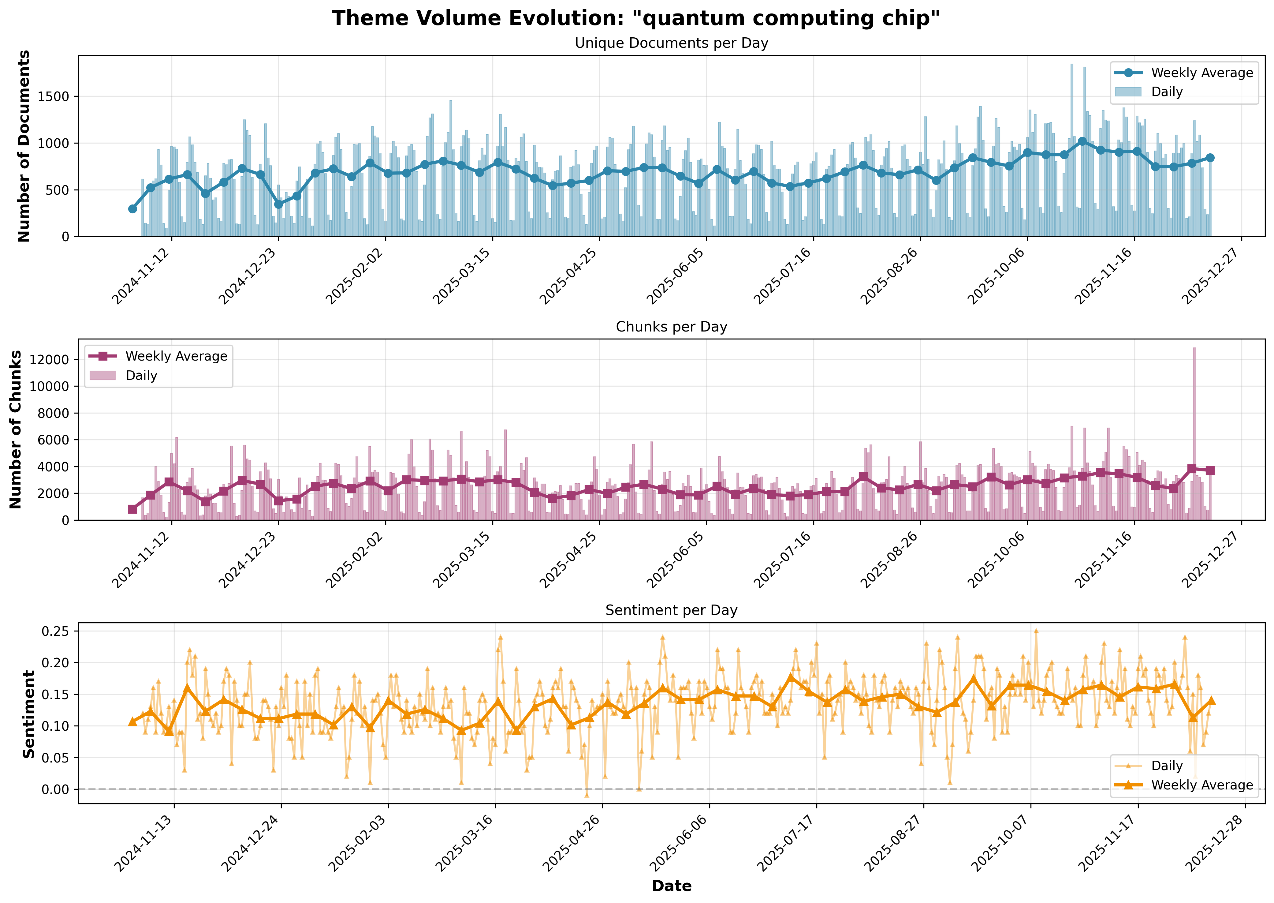
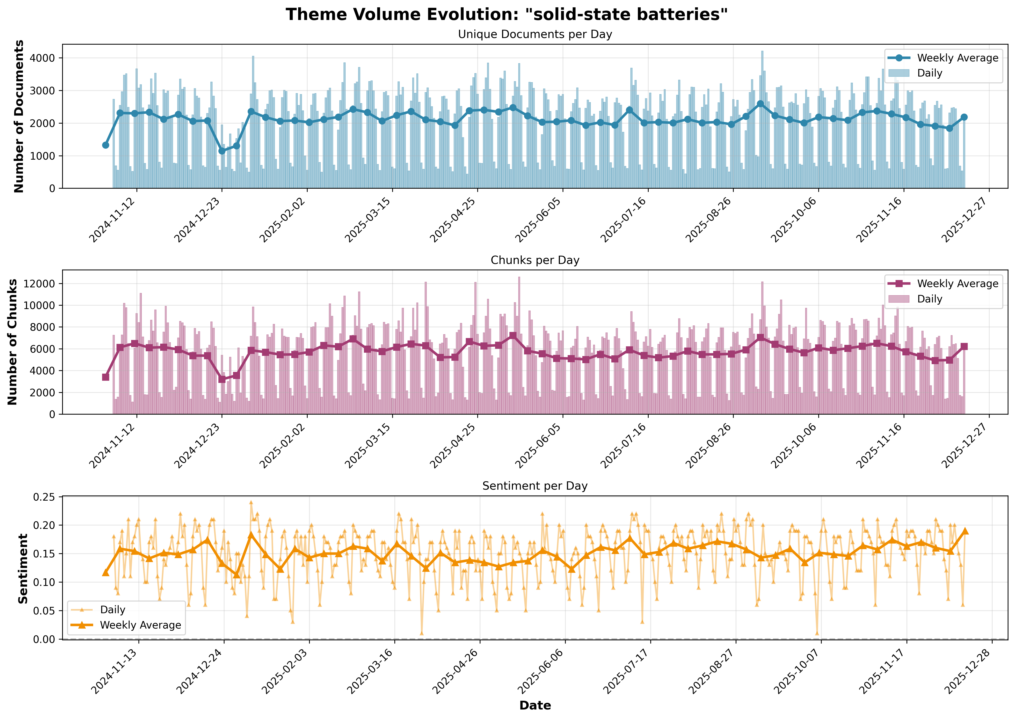
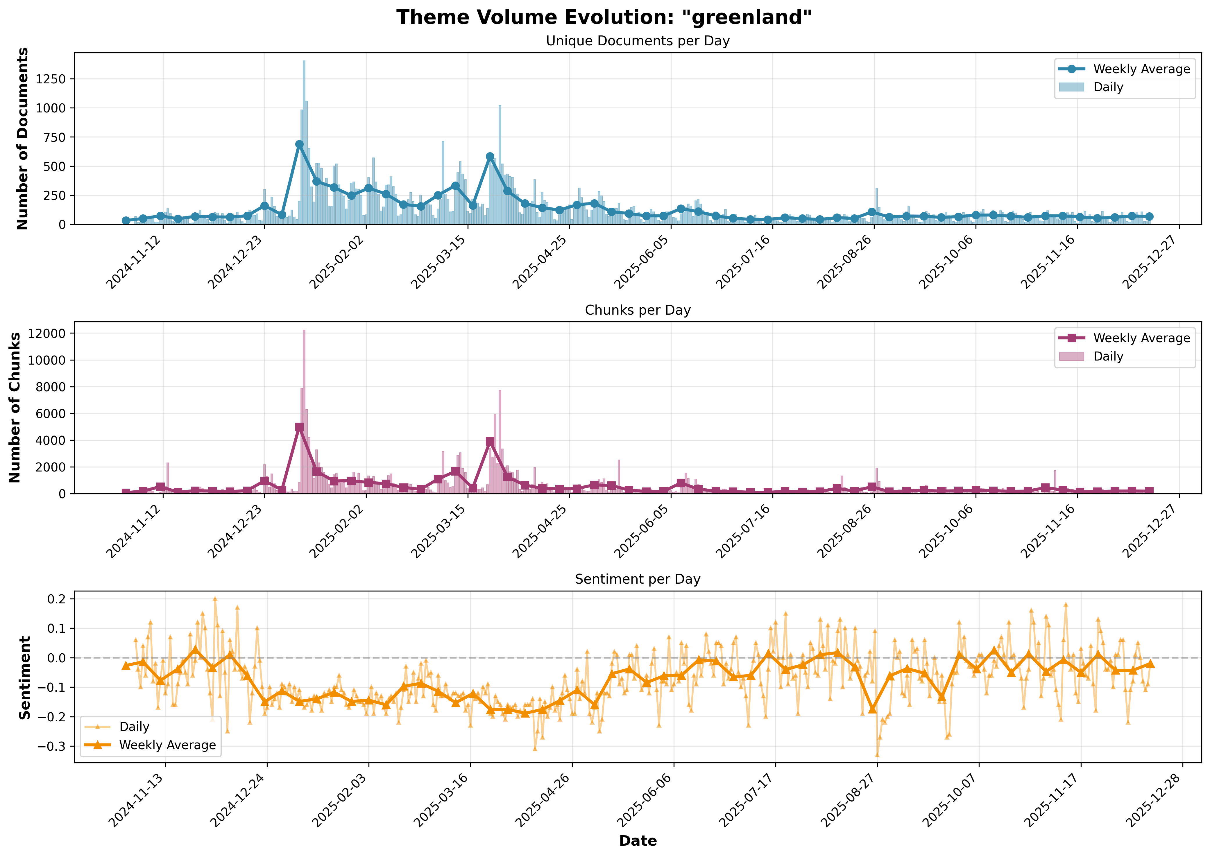
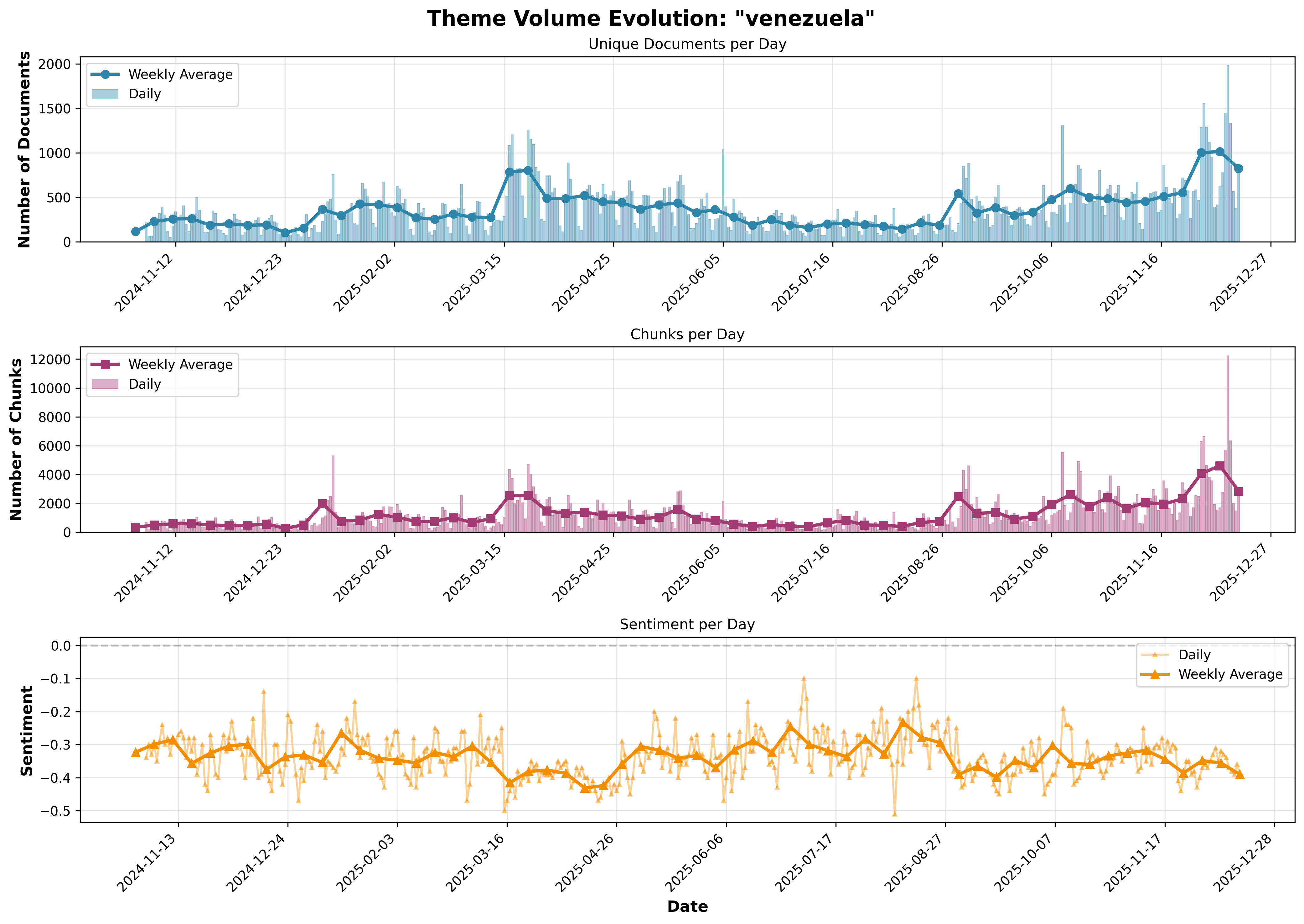
The script generates a high-resolution (300 DPI) PNG chart with a timestamped filename:- Unique Documents per Day: Daily document counts as bars with weekly average line
- Chunks per Day: Daily chunk counts as bars with weekly average line
- Sentiment per Day: Daily sentiment values as a line with weekly average line
Example Charts
Here are example charts generated for different themes:- Tariffs Impact
- Quantum Computing
- Solid State Batteries
- Greenland
- Venezuela
Theme: 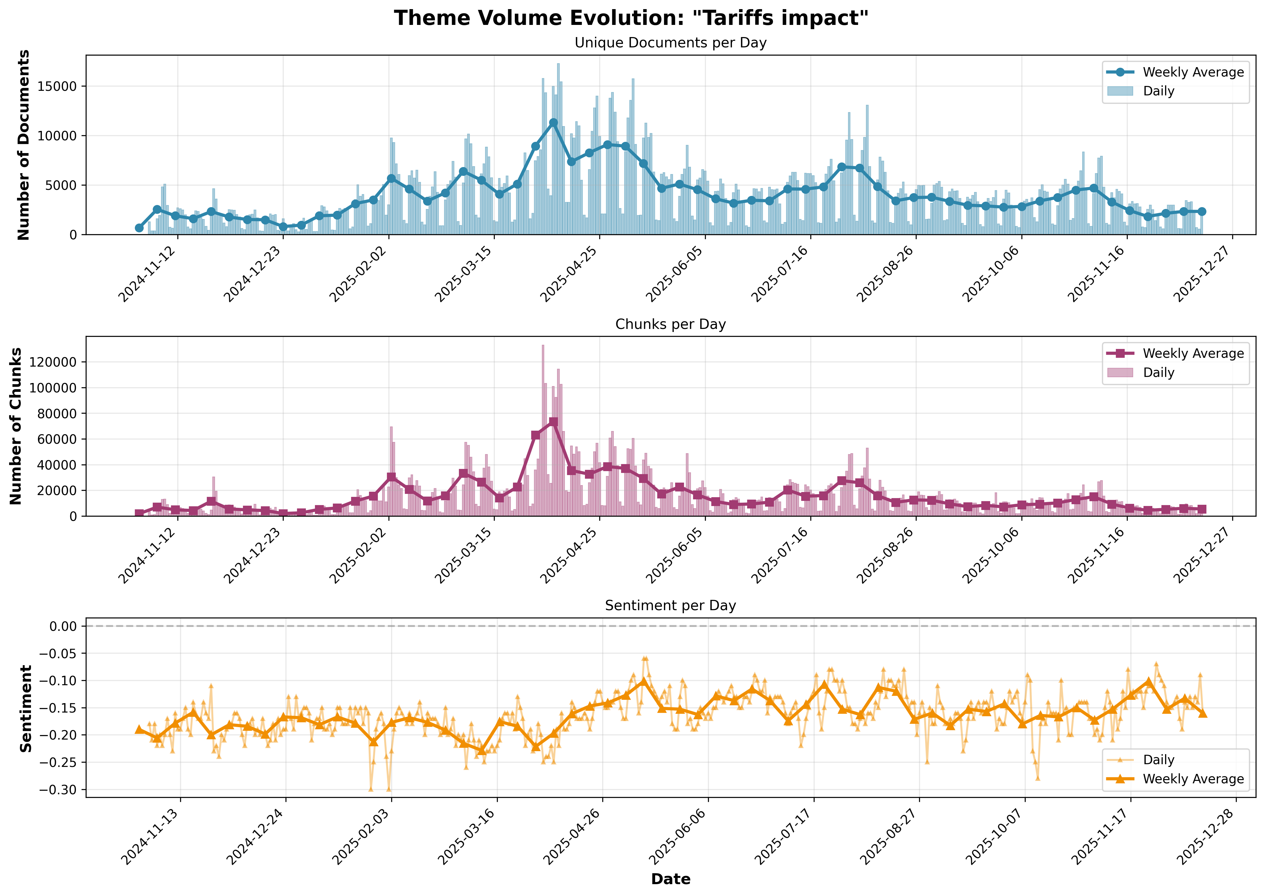
"Tariffs impact"